
Chart of the Day: Value of Advice
Today’s Chart of the Day from JP Morgan shows that as of May 15, 2025, the average retail investor is underperforming the market by 2%.
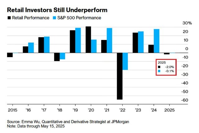
Today’s Chart of the Day from JP Morgan shows that as of May 15, 2025, the average retail investor is underperforming the market by 2%.
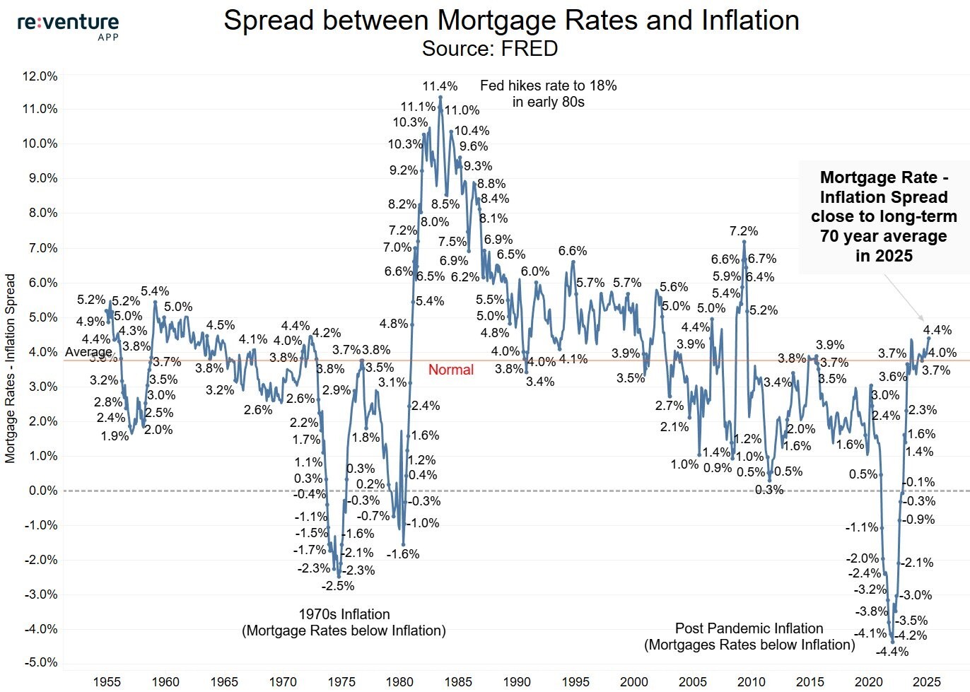
Today’s Chart of the Day from re:venture shows the difference between mortgage rates and inflation going back to 1955.
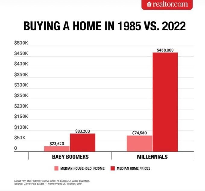
Today’s Chart of the Day comes from Realtor.com and shows the difference between the average price of homes vs. incomes. It took 3.5 years of income..
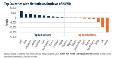
Today’s Chart of the Day from First Trust shows the top inflows and outflows of high-net-worth individuals (HNWI) who have $1,000,000 or more in..
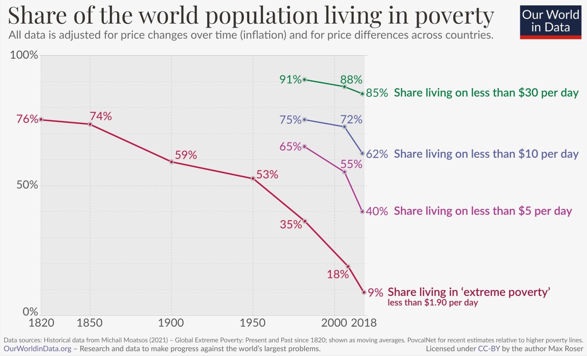
Today’s Chart of the Day from OurWorldData.org was shared by @petermallouk on X showing the share of the world living in poverty.
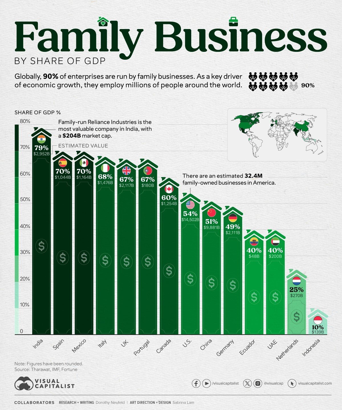
Today’s Chart of the Day and comments are shared by my fellow Portfolio Manager Angie Parsons. The chart from Visual Capitalist shows the percent of..
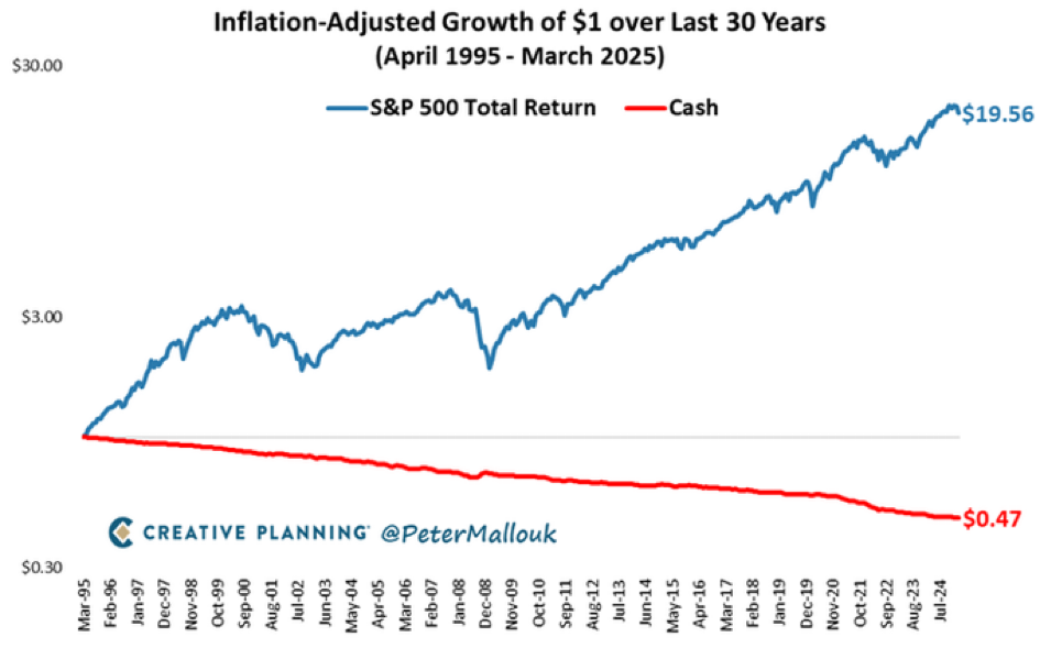
Today’s Chart of the Day from @petermallouk on X and shows the value of a dollar invested in the S&P 500 vs. sitting in cash for the last 30 years.

Today’s Chart of the Day is provided by my colleague and fellow Portfolio Manager Angie Parsons. The chart, prepared by YCharts, shows the “Bull..
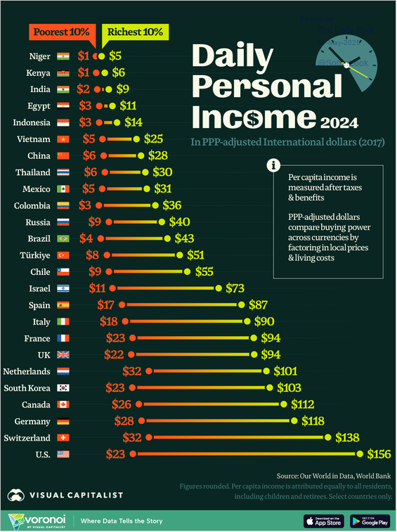
Today’s Chart of the Day from Visual Capitalist ranks the poorest 10% and richest 10% daily personal incomes in various countries.
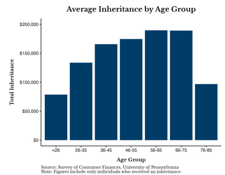
Today’s Chart of the Day is the Average Inheritance by Age Group from a University of Pennsylvania survey of individuals who have received an..
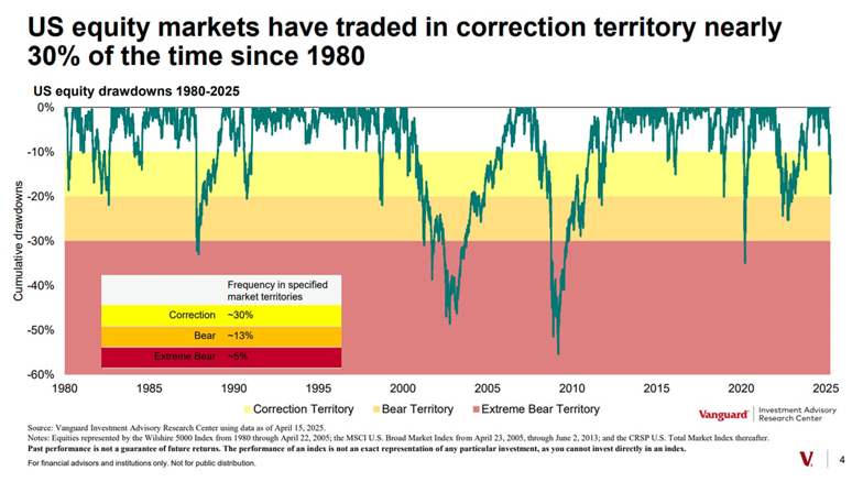
Today’s Chart of the Day is from Vanguard and shows that, since 1980, the stock market has traded in the 10%-20% down range, aka Correction..
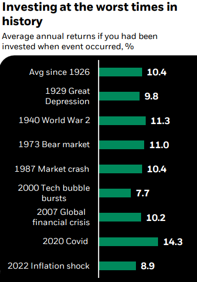
Today’s Chart of the Day is from Mark Peterson with BlackRock. The chart, going back to 1926, shows the returns if you had been invested on the day..
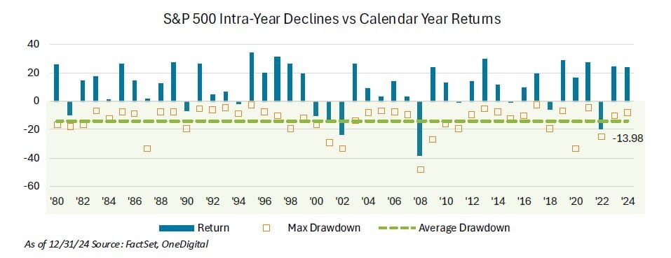
Today’s Chart of the Day from OneDigital shows the return of the S&P 500 each calendar year since 1980 as well as the maximum drawdown during the..
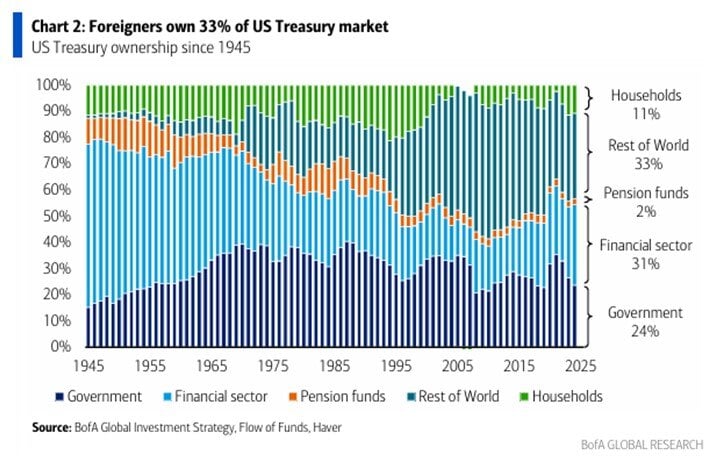
Today’s Chart of the Day from BofA Global Research shows the percentages of US treasury bond ownership spanning from 1945 to 2025.
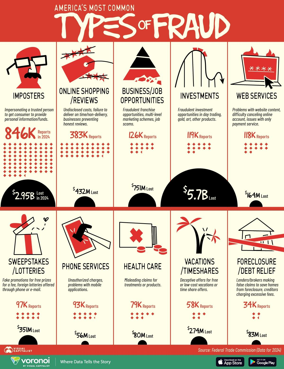
Today’s Chart of the Day is from Visual Capitalist detailing and ranking common types of fraud. The report suggests losses are half a trillion..