Chart of the Day: Less and Less Shares Since 1999
Today’s Chart of the Day is from the Financial Times with a note from Callum Thomas. The chart shows that there is a shrinking level of publicly held stocks. Why so?

Today’s Chart of the Day is from the Financial Times with a note from Callum Thomas. The chart shows that there is a shrinking level of publicly held..
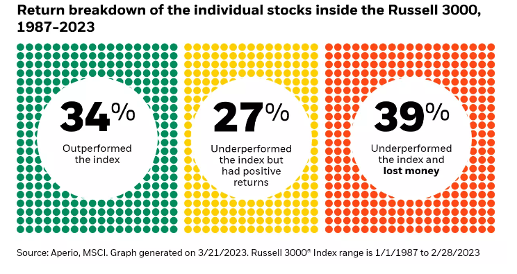
Today’s Chart of the Day from Aperio shows the percentage of individual stocks in the Russell 3000, which represents the 3,000 largest stocks in the..
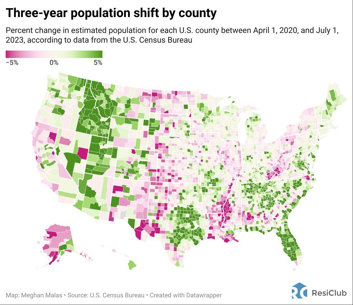
Today’s Chart of the Day is from Meghan Malas with data from the US Census Bureau.

In an act of desperation, Terry* frantically picked up the phone and called his Personal Banker at Crews Bank & Trust. Minutes before, when he logged..

Today’s Chart of the Day is from an article discussed in "A Wealth of Common Sense" by Ben Carlson with data from a research paper by David..
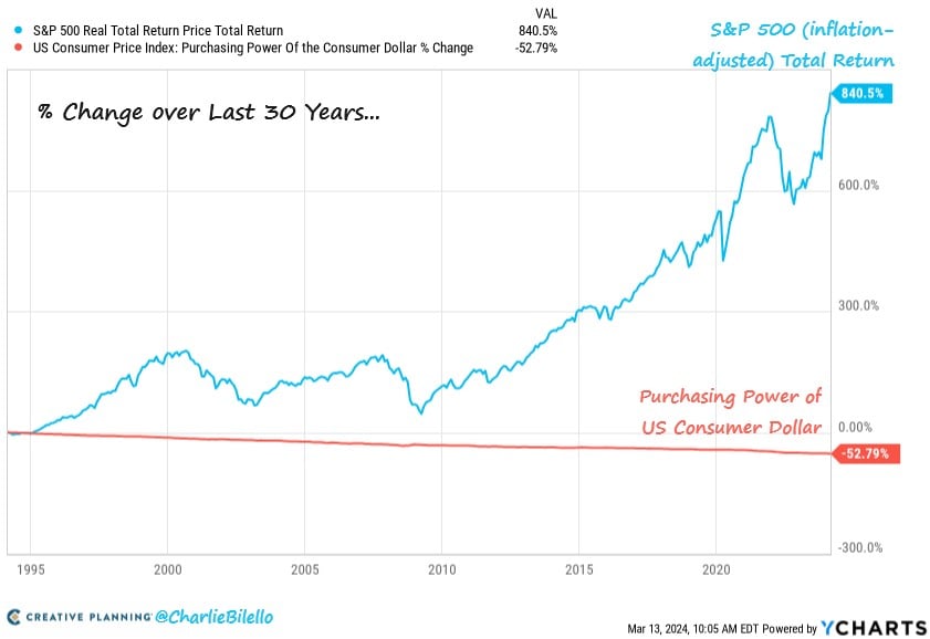
Today’s Chart of the Day comes from Charlie Bilello with information from YCharts. Over the last 30 years, inflation reduced the value of a dollar by..

When should parents talk to their children about money and how does one go about it? Just as you wouldn't throw a child into a swimming pool without..
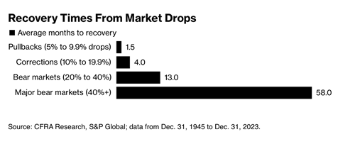
Today’s Chart of the Day from CFRA Research goes all the way back to 1945 and shows the average number of months it takes to “recover” from market..
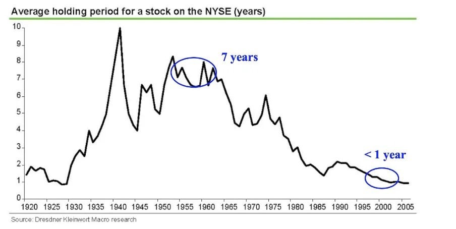
Today’s Chart of the Day is from Dresdner Kleinwort Macro Research and notes the average holding period of stocks since 1920.
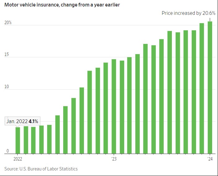
Today’s Chart is from Charlie Bilello, with data from the US Bureau of Labor, showing that auto insurance has increased more than 20% from last year.
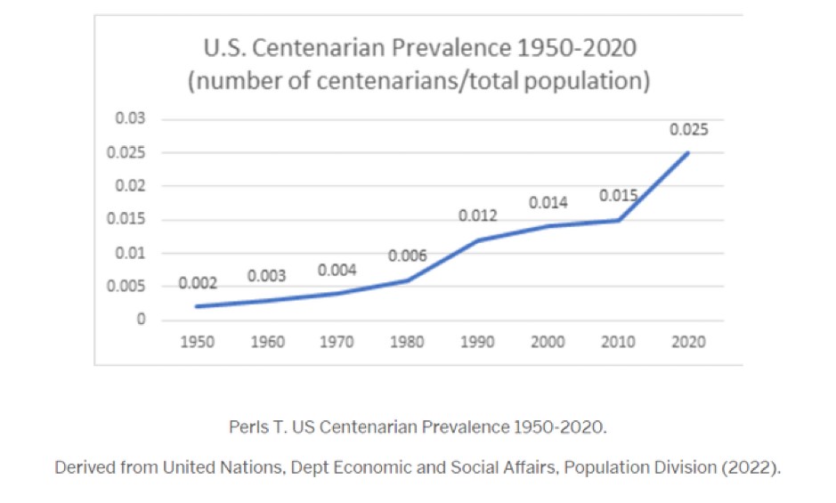
Today’s Chart of the Day shows the percentage of people who have reached the age of 100.

When it comes to housing options, there’s a diverse array to choose from: multi-family homes, single-family houses, townhouses, co-ops, manufactured..
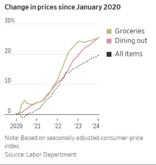
Today’s Chart of the Day is from the Wall Street Journal utilizing data from the Labor Department, showing that you are not imagining things; there..
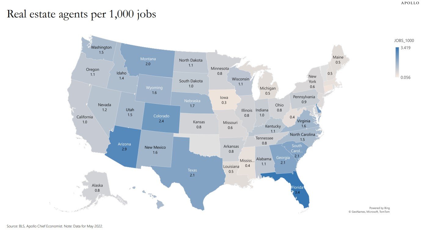
Today’s Chart of the Day comes from Dr. Torsten Slok from Apollo and shows the number of real estate agents per 1,000 jobs.
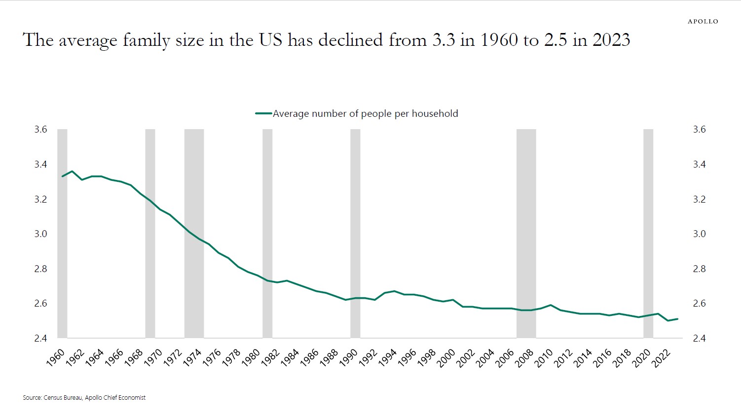
Today's chart, sourced from Apollo and the Census Bureau data, illustrates a decline in the average family size from 3.3 members per household in..