Chart of the Day: The Great Exodus Continues
Contents
About the Author

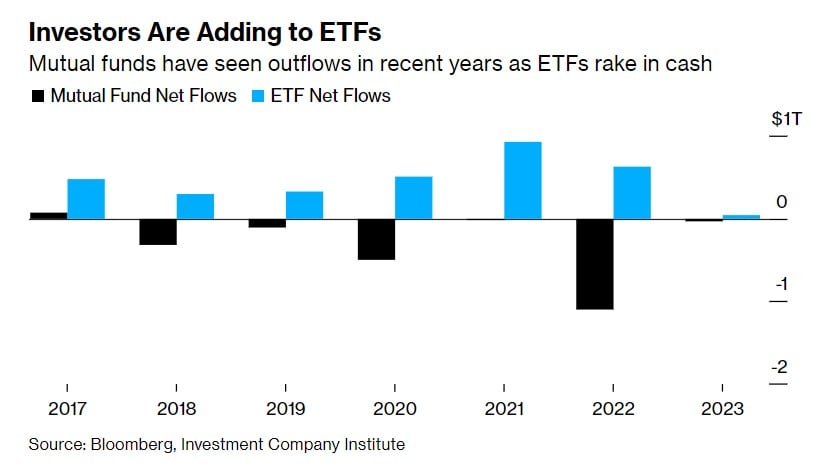
Today’s Chart of the Day from Bloomberg shows the net growth of Exchange Trade Funds (ETFs), in blue, versus the loss from Mutual Funds, in black. Last year was especially brutal when the downturn allowed investors to finally exit their positions with less capital gain. Why? Investors are realizing ETFs are superior investments due to their lower costs, higher tax efficiency, increased liquidity, and greater transparency.
Samuel serves as Senior Vice President, Chief Investment Officer for the Crews family of banks. He manages the individual investment holdings of his clients, including individuals, families, foundations, and institutions throughout the State of Florida. Samuel has been involved in banking since 1996 and has more than 20 years experience working in wealth management.
Investments are not a deposit or other obligation of, or guaranteed by, the bank, are not FDIC insured, not insured by any federal government agency, and are subject to investment risks, including possible loss of principal.